

Results 1 to 1 of 1
Thread: Employment Chart Roundup
Thread Information
Users Browsing this Thread
There are currently 1 users browsing this thread. (0 members and 1 guests)
 LinkBack URL
 About LinkBacks
-
03-08-2010, 01:57 AM #1Senior Member


- Join Date
- May 2007
- Location
- South West Florida (Behind friendly lines but still in Occupied Territory)
- Posts
- 117,696
Employment Chart Roundup

Employment Chart Roundup
Barry Ritholtz Mar 7, 2010 5:57PM
Once again, weâve scoured the intertubes looking for the most interesting, unusual and informative charts about the Employment Situation, to use the BLS vernacular.
Here are 10 of the best of what we found (as always, click for larger charts):
Labor Utilization: U3 versus U6 Unemployment
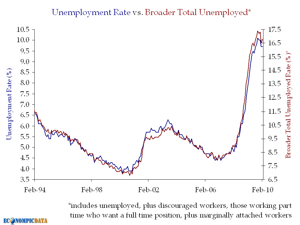
Courtesy of EconomPic ~~~
Monthly Change in Payroll Employment
(1000s)
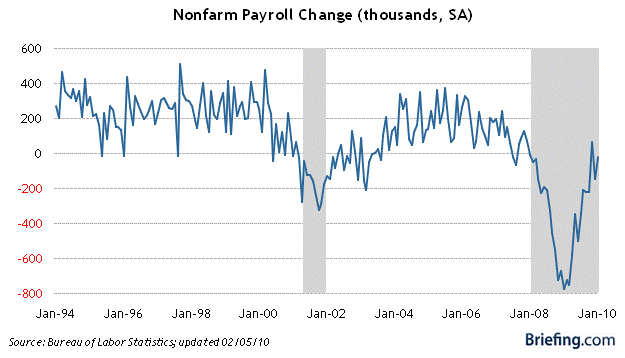
courtesy of Briefing.com
~~~
Unit Labor Cost Relative to Inflation
(82% correlation)
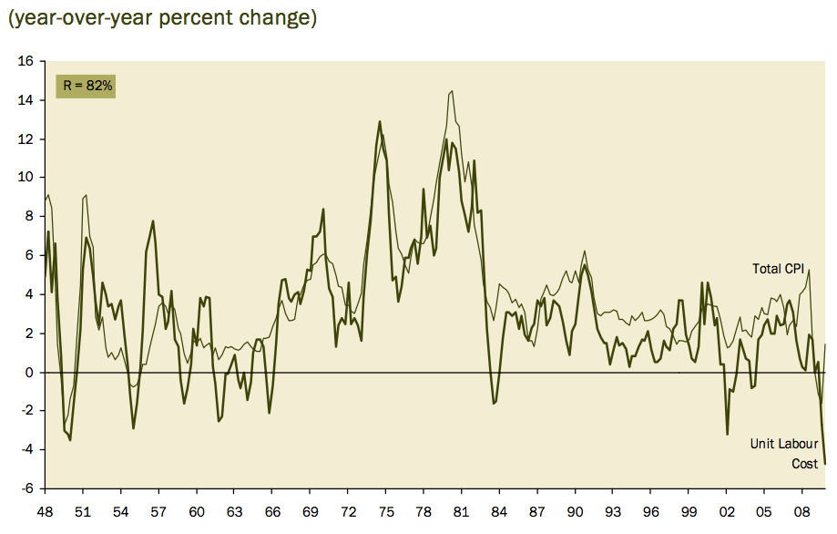
Courtesy of Haver Analytics (David Rosenberg, Gluskin Sheff)
~~~
Unemployment Rate by Educational Attainment
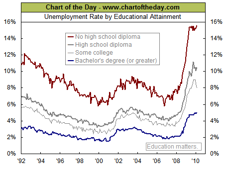
courtesy of Chart of the Day
~~~
Temporary Help Hiring
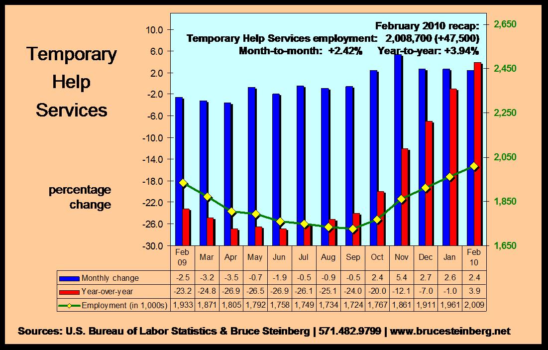
Courtesy of Bruce Steinberg.net
~~~
Some Sectors Show Signs of Life

Courtesy of EconomPic
~~~
Comparing Post WW2 Recessions
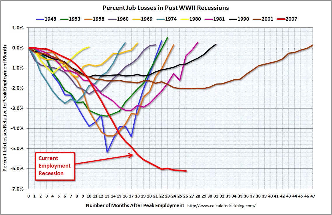
Courtesy of CalculatedRisk
~~~
NFIB Survey Data:

Courtesy of NFIB
~~~
Breakdown of Unemployed by Race, Gender
(Interactive WSJ chart)
http://online.wsj.com/article/SB1000142 ... nteractive
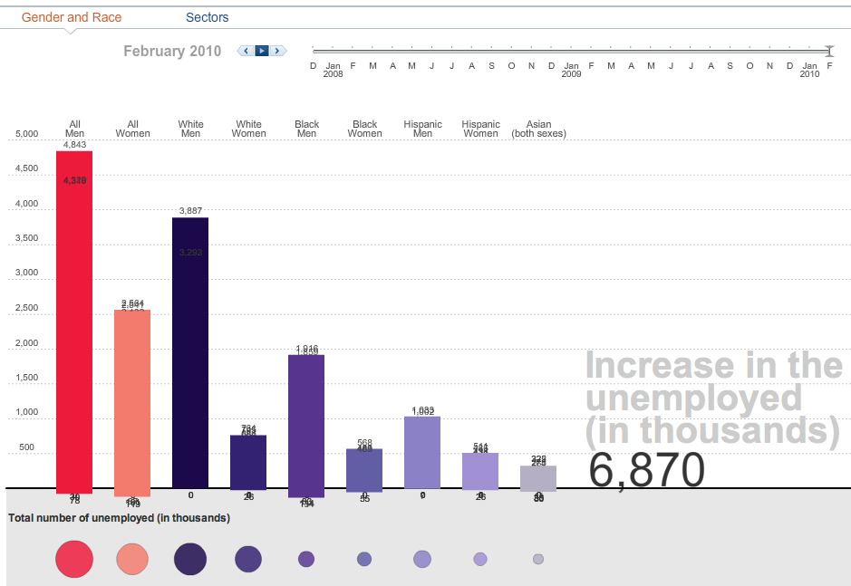
courtesy of WSJ
~~~
Payroll Employment and Hiring Plans
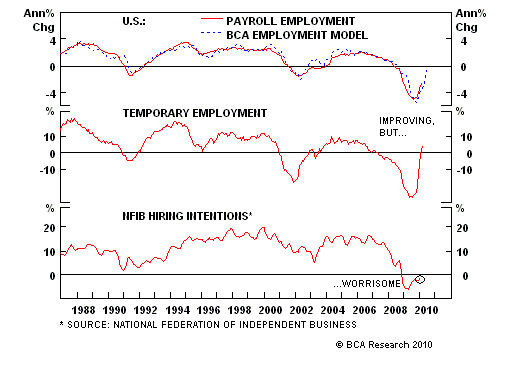
Courtesy of BCA
http://www.roubini.com/us-monitor/25849 ... rt_roundupJoin our efforts to Secure America's Borders and End Illegal Immigration by Joining ALIPAC's E-Mail Alerts network (CLICK HERE)


 Reply With Quote

72 Hours Till Deadline: Durbin moves on Amnesty
04-28-2024, 02:18 PM in illegal immigration Announcements