

Results 1 to 1 of 1
Thread Information
Users Browsing this Thread
There are currently 1 users browsing this thread. (0 members and 1 guests)
 LinkBack URL
 About LinkBacks
-
01-29-2010, 09:03 PM #1Senior Member


- Join Date
- May 2007
- Location
- South West Florida (Behind friendly lines but still in Occupied Territory)
- Posts
- 117,696
GDP Mirage - Here's the Chart You Should Look At
Friday, January 29, 2010
GDP Mirage - The Last Hurrah
4th quarter GDP came in at 5.7%. Discounting revisions (and probably even counting them), that was the last hurrah. Here is the story from two highly respected analysts.
Dave Rosenberg: The Houdini Recovery https://ems.gluskinsheff.net/Articles/L ... 012910.pdf
First, the report was dominated by a huge inventory adjustment â not the onset of a new inventory cycle, but a transitory realignment of stocks to sales. Excluding the inventory contribution, GDP would have advanced at a much more tepid 2.2% QoQ annual rate, not really that much better than the soft 1.5% reading in the third quarter.
Second, it was a tad strange to have had inventories contribute half to the GDP tally, and at the same time see import growth cut in half last quarter.
Third, if you believe the GDP data â remember, there are more revisions to come â then you de facto must be of the view that productivity growth is soaring at over a 6% annual rate. No doubt productivity is rising â just look at the never-ending slate of layoff announcements. But we came off a cycle with no technological advance and no capital deepening, so it is hard to believe that productivity at this time is growing at a pace that is four times the historical norm. Sorry, but we're not buyers of that view.
In the fourth quarter, aggregate private hours worked contracted at a 0.5% annual rate and what we can tell you is that such a decline in labour input has never before, scanning over 50 years of data, coincided with a GDP headline this good. Normally, GDP growth is 1.7% when hours worked is this weak, and that is exactly the trend that was depicted this week in the release of the Chicago Fedâs National Activity Index, which was widely ignored. On the flip side, when we have in the past seen GDP growth come in at or near a 5.7% annual rate, what is typical is that hours worked grows at a 3.7% rate.
No matter how you slice it, the GDP number today represented not just a rare but an unprecedented event, and as such, we are willing to treat the report with an entire saltshaker â a few grains wonât do.
Calculated Risk: A Few Comments on Q4 GDP Report http://www.calculatedriskblog.com/2010/ ... ed+Risk%29
Any analysis of the Q4 GDP report has to start with the change in private inventories. This change contributed a majority of the increase in GDP, and annualized Q4 GDP growth would have been 2.3% without the transitory increase from inventory changes.
Unfortunately - although expected - the two leading sectors, residential investment (RI) and personal consumption expenditures (PCE), both slowed in Q4.
PCE slowed from 2.8% annualized growth in Q3 to 2.0% in Q4.
RI slowed from 18.9% in Q3 to just 5.7% in Q4.
It is not a surprise that both key leading sectors are struggling. The personal saving rate increased slightly to 4.6% in Q4, and I expect the saving rate to increase over the next year or two to around 8% - as households repair their balance sheets - and that will be a constant drag on PCE.
This graphs shows Residential investment (RI) as a percent of GDP since 1947.
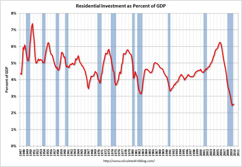
Notice that RI usually recovers very quickly coming out of a recession. This time RI is moving sideways - not a good sign for a robust recovery in 2010.
There is more commentary and another chart in the article. It's well worth a look.
Calculated Risk says "Unfortunately - although expected - the two leading sectors, residential investment (RI) and personal consumption expenditures (PCE), both slowed in Q4."
I have a different perspective: I believe it would be unfortunate if consumers started spending. This deleveraging is much needed along with a rise in the savings rate.
Recovery Stalls
Inquiring minds are reading GDP Soars 5.7%, But Here's the Chart You Should Look At http://business.theatlantic.com/2010/01 ... ook_at.php
U.S. GDP in the last three months of 2009 soared by 5.7%. That's good news, but the number doesn't tell the whole story.
To get a more complete picture of our economic growth, check out the Chicago Fed National Activity Index (NAI) -- what Barry Ritholz calls "the best economic indicator you've never heard of."
The newest NAI report on 2009's fourth quarter is out, and it's not as sanguine as GDP.
Here's the chart:
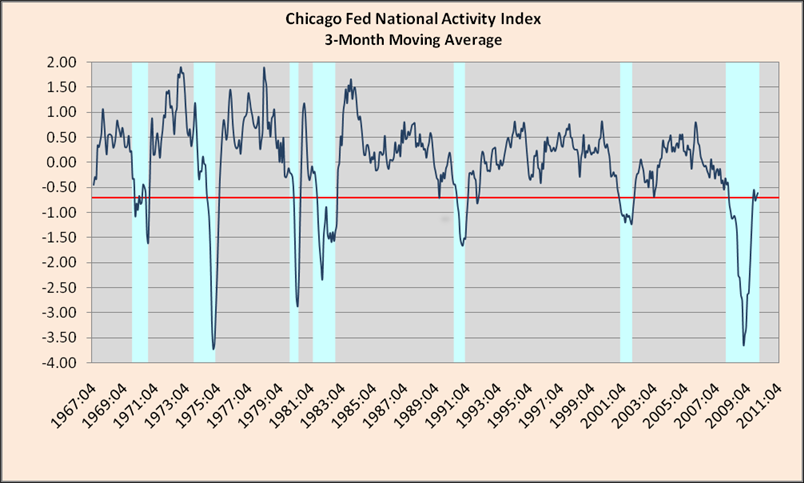
What's happening here? The short version is this: The economy started to rally dramatically last summer, but the recovery has stalled since September.
Here's the longer, more informative version. NAI tracks 85 economic indicators, which lumped into four big categories: production and income (P&I); employment, unemployment, and hours (EU&H); personal consumption and housing (C&H); and sales, orders, and inventories (SO&I). The graph below explains how these categories performed in the second half of 2009.
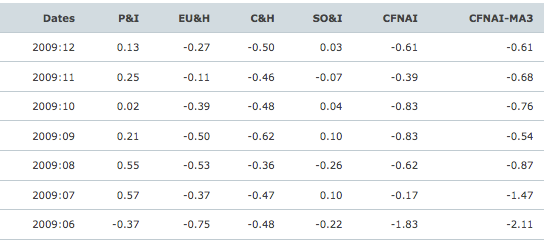
I would be particularly concerned about what the chart says about the consumer and housing markets. The C&H figure barely budged from near recession levels (the NAI considers figures below -0.70 consistent with a recession) in the last six months of 2009. Consumer spending continues to be anchored down by broad unemployment. The housing market had a particularly rough December -- new home sales fells and foreclosures, defaults and delinquencies continued to rise.
Note the concern over residential housing and consumer spending, quite similar to Calculated Risk.
The mainstream media consensus thinks this is a good number.
âThe economy is still healing and improving,âJoin our efforts to Secure America's Borders and End Illegal Immigration by Joining ALIPAC's E-Mail Alerts network (CLICK HERE)


 Reply With Quote

10% To 27% of 30 Million Non-Citizens Are Registered To Vote
05-15-2024, 10:29 AM in General Discussion