

Results 1 to 1 of 1
Thread Information
Users Browsing this Thread
There are currently 1 users browsing this thread. (0 members and 1 guests)
 LinkBack URL
 About LinkBacks
-
08-19-2010, 12:27 AM #1Senior Member


- Join Date
- May 2007
- Location
- South West Florida (Behind friendly lines but still in Occupied Territory)
- Posts
- 117,696
U.S. Treasury Bonds Inverse Chart, If This Were A Stock....
U.S. Treasury Bonds Inverse Chart, If This Were A Stock....
Interest-Rates / US Bonds
Aug 18, 2010 - 10:50 AM
By: Guy_Lerner
See figure 1 a weekly price chart. The 40 week moving average (i.e, red line) is heading higher, and prices are trading above key pivot points, which are areas of support (buying) and resistance (selling). In essence, this is a "beautiful" chart with lots of momentum (i.e., note the breakout gaps). If this were a stock, the analysts and pundits would be all over the "breakout" ---blah, blah, blah.
Figure 1. Price Chart/ weekly
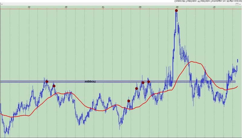
But figure 1 isn't a stock, it is the yield on the 30 year Treasury, and the chart has been turned upside down. What I hear and read is this move in Treasury bonds isn't sustainable. A sub 3% yield isn't possible, but isn't that what "they" said about a sub 4% yield? Which happens to be in the rear view mirror.
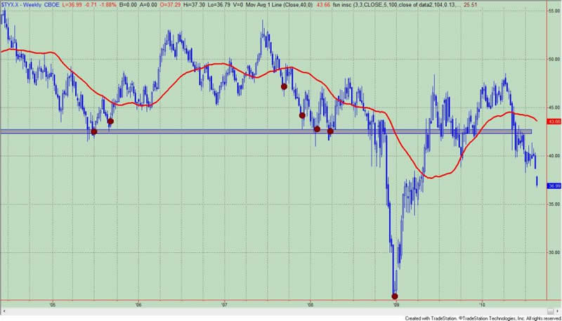
People still don't believe, and they are not interpreting the significance of the price action correctly. Maybe if this were a stock people would be wowed by the price action. But they aren't. For the record, figure 2 is a weekly chart of the yield on the 30 year Treasury bond (symbol: $TYX.X). Are the low yields of late 2008 the next stop?
Figure 2. $TYX.X/ weekly
In up coming commentaries, I will have more on why I think this move is even more sustainable than most analysts are currently anticipating. I last wrote about this secular theme on July 8, 2010: "The Case For Treasury Bonds". http://www.marketoracle.co.uk/Article20940.html
By Guy Lerner
http://thetechnicaltakedotcom.blogspot.com/
http://www.marketoracle.co.uk/Article22002.htmlJoin our efforts to Secure America's Borders and End Illegal Immigration by Joining ALIPAC's E-Mail Alerts network (CLICK HERE)


 Reply With Quote

10% To 27% of 30 Million Non-Citizens Are Registered To Vote
05-15-2024, 10:29 AM in General Discussion