

Results 1 to 1 of 1
Thread Information
Users Browsing this Thread
There are currently 1 users browsing this thread. (0 members and 1 guests)
 LinkBack URL
 About LinkBacks
-
12-08-2010, 01:56 AM #1Senior Member


- Join Date
- May 2007
- Location
- South West Florida (Behind friendly lines but still in Occupied Territory)
- Posts
- 117,696
Trend of Unemployment Claims as % Continuing Unemployment
Tuesday, December 07, 2010 12:18 PM
Trend of Unemployment Claims as % of Continuing Unemployment; US Population vs. Employment, vs. Labor Force, vs. Continued Unemployed
Inquiring minds might be interested in a pair of charts courtesy of reader Tim Wallace. Click on either chart to see a sharper image.

Note the trendline of new unemployment claims as a percentage of continuing unemployment.
Over time, the chart suggests it takes longer and longer to find a job. There was a brief respite in the Clinton years, no doubt because of the internet boom, not because Clinton did anything particularly special.
The trend is unbroken all the way back to 1967. It just was not noticeable before because overall unemployment was lower.
US Population vs. Employment, vs. Labor Force, vs. Continued Unemployed
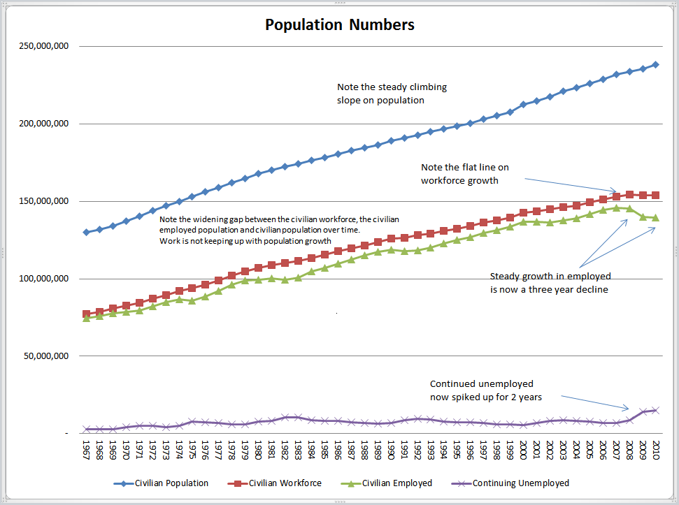
The recent spike in continued unemployed is especially aggravating given the flat growth in employment.
Mike "Mish" Shedlock
http://globaleconomicanalysis.blogspot. ... as-of.htmlJoin our efforts to Secure America's Borders and End Illegal Immigration by Joining ALIPAC's E-Mail Alerts network (CLICK HERE)


 Reply With Quote

Former U.K. immigration minister: Migrants do more harm than...
05-02-2024, 12:14 AM in General Discussion